Colour is one of the main tools designers use when creating a particular look. Feature walls, coloured, lights, contrasting carpets, art work on the walls and even coloured furniture all plays a role in bringing together the finished product. Colour is known to be useful when creating different moods, bright citrus colours can be very stimulating for the senses and are often associated with cheerful spaces and might be used in busy areas. Very dark colours are excellent for creating ambiance. White (or an absence of colour completely) usually signifies hygiene and clinical style.
When our clients approach us they usually fall into one of two camps. Historically an office space would rely on neutral colours and we still find that many business are cautious about introducing colour into their workspaces, preferring to stick with whites, greys, navy blues. However, we are finding more and more companies are specifying bold colours in their designs – often colours used in their branding, to create vibrant looks.
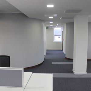
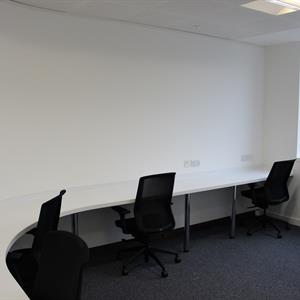
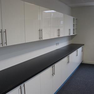
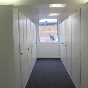
Two of our recent projects exemplify these different approaches to workspace design. Our ongoing work for Morrisons Solicitors uses predominantly white to achieve a bright, glossy almost futuristic space. The white furniture and decoration is complimented by the organic use of curved lines on the walls and some of the furniture used. The finished product will be minimalist, neat, clean and will give the client an atmosphere of order and calm. We chose our storage wall from Freewall in a white gloss finish to conceal the huge density of paperwork generated by a firm of solicitors. The bespoke curved partition wall was built to zone the previously open space allowing for storage, post and a quiet space. The quiet workspace also included a purpose built curved worktop to continue these lines. The cabinets in the post room from Howdens are similarly glossy and light reflective. The neutral grey carpet from Forbo is broken up with lines in another grey to visually add a sense of space.
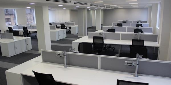
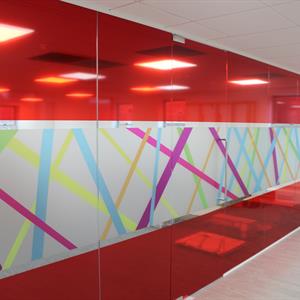
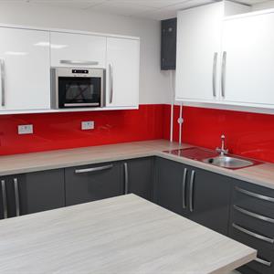
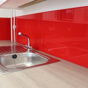
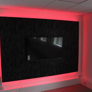
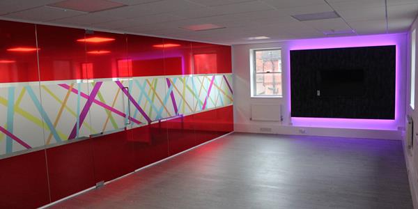
In contrast our design for Driver Hire uses colour confidently. Glass walls with bright red manifestation and a bright rainbow coloured panel divide the space. The red Perspex black splash in the kitchen area compliments the doors and adds a pop of colour to the monochrome units. Colour changing led lighting was also used to full effect under kitchen worktops and around an inset media wall. Finally, we specified desks with bright red powder coated steel frames with white gloss tops to complete the look.
We feel that both offices are bright, light and we hope our clients enjoy working in their new environments.
